

No framework lock-in
The components are native JavaScript custom elements. They run in React, Angular, Vue, Next.js, or on a page without any framework at all.

You already have a portal, an intranet, or a business application. What’s missing is a powerful search experience—one that integrates so seamlessly that no one notices it comes from an external solution.
That’s exactly what iFinder 6 is designed for. Its entire user interface is provided as a catalog of individually reusable Web Components. Simply include a JavaScript library, place HTML tags wherever you want the search bar, filters, or results list to appear, and customize the look and feel with CSS to match your corporate design.
The same components are also used to build the reference interface included with iFinder. So you’re not working with a stripped-down integration version—you’re using the exact same building blocks that we use ourselves.
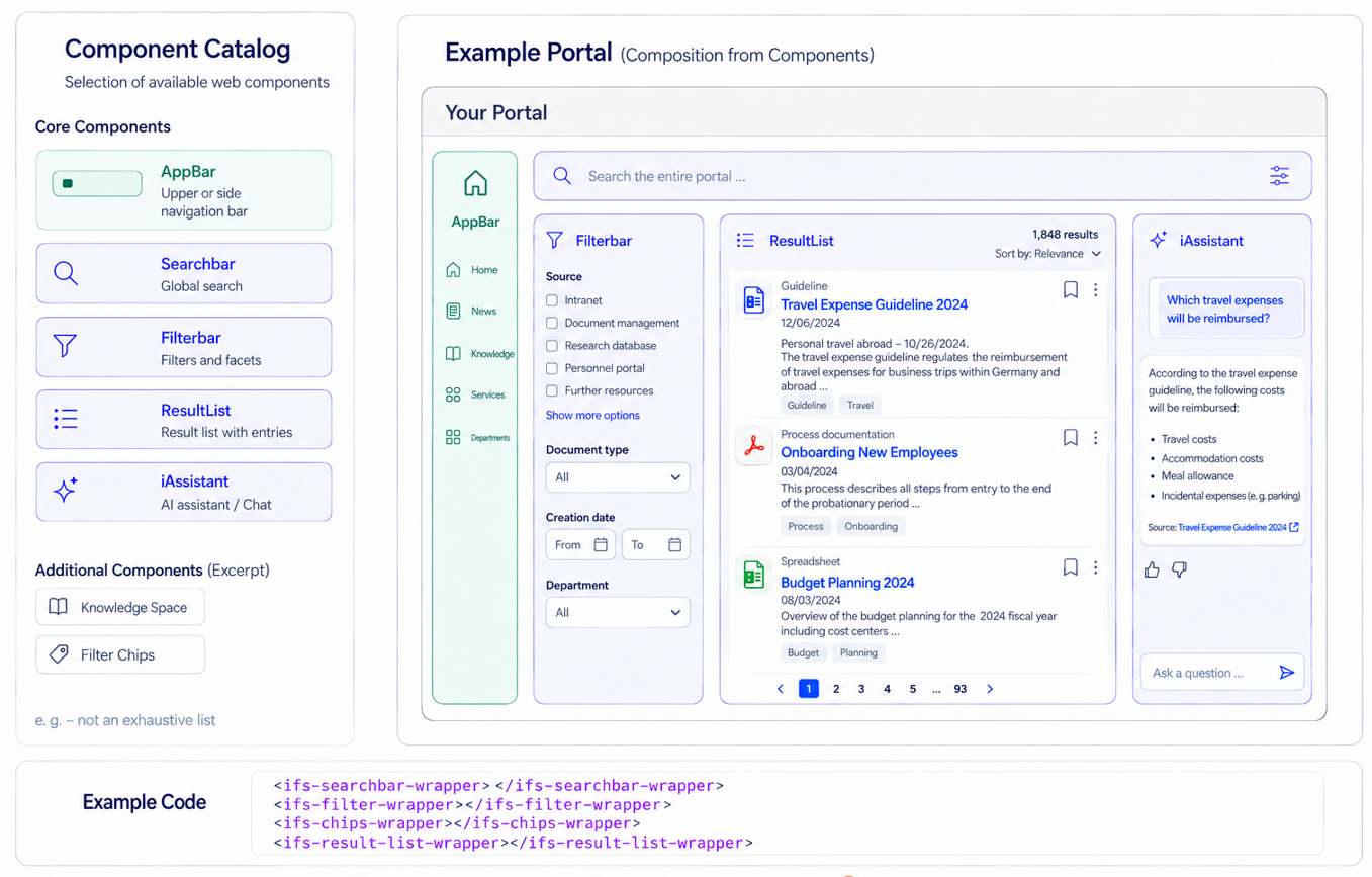
Example AI-generated illustration
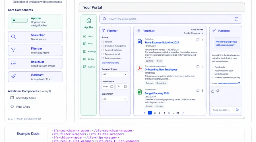
There are two ways to integrate iFinder. Which one is the better fit depends primarily on how much of your own user interface is already in place.



The iFinder components deliberately avoid using Shadow DOM. What is often considered an advantage in many Web Component libraries can become an obstacle when integrating with an existing corporate design: you can’t easily access the styles. With iFinder, you can.
Colors, fonts, and spacing are controlled through CSS Custom Properties. For everything else, you can target the internal selectors directly.
The internal selectors have stable names, so your overrides remain intact across updates. This mechanism is already used in the standard distribution: config.json loads plugins.css and plugins.js, while the included reference interface uses files such as plugins/ihub.css and plugins/layout-overrides.css.
In other words, you’re using the same approach we use ourselves.

CSS and theming — Colors, fonts, and spacing can be adapted to your corporate design via CSS custom properties. Since the web components don't use shadow DOM, existing styles can be selectively extended and overridden.
Custom templates — For further customization, you can, for example, replace the result-card template and individually design the structure, metadata, thumbnails, and text excerpts.
Configuration via properties — Components can be adapted to different use cases via properties — for example, to search profiles, user roles, or application contexts.
Callbacks and plugins — Via callbacks and JavaScript extensions, you can integrate your own behavior and business logic without having to modify the iFinder code itself.

iFinder Web Components are based on native custom elements and can be integrated into modern frontend frameworks such as React, Angular, Vue, Next.js, or Svelte.
Example projects are available for React and Angular. In other frameworks, integration happens via standard support for custom elements.

iFinder Web Components can be integrated into responsive interfaces and adapt to different screen sizes and existing layouts.
They are designed for use in accessible applications. The specific conformance level, such as BITV 2.0 or EN 301 549, should only be stated on the page if it is backed by a current audit or evidence.
No. They are native JavaScript custom elements. They work in any modern framework as well as in an HTML page without a framework. Ready-made example projects for React and Angular are available on GitHub.
Yes, on four levels: CSS custom properties for colors and fonts, direct overriding of internal selectors, complete replacement of the result-card template, and properties set at runtime. The components don't use shadow DOM, so your styles apply without detours.
No. You can use individual components — just the search bar in your header, just the result list on a results page. Alternatively, you can adopt the complete structure, including navigation, with App Main
Yes. The chat view and workspace are separate components. You can integrate the AI assistant into an existing application without adopting the search interface.
Yes. Every component provides callbacks that let you override default behavior, for example when submitting a search query. In addition, external JavaScript plugins can be loaded to bring in your own business logic — for example, to switch the search profile depending on role or location.
Yes. The components adopt the responsive behavior of the surrounding application.
Yes. Users can chat directly with the documents they find. Several relevant documents can also be selected from the hit list and bundled in so-called “smart collections.” There, a targeted chat based on precisely this set of documents is possible—even jointly within a team.
Yes. A live test instance is available, allowing you to integrate and evaluate the components in your own application.


